11 quick UX tips to improve landing page conversion
It’s easy to create a landing page to promote a product or a service, but is it really conveying your message enough to boost conversion?
It’s easy to create a landing page to promote a product or a service, but is it really conveying your message enough to boost conversion?
It’s easy to create a landing page to promote a product or a service, but is it really conveying your message enough to boost conversion?
It’s becoming more challenging nowadays to convince customers to trust you.
There’s an increasing online clutter that can make any landing page look spammy, but there are always quick fixes to improve conversion, especially when focusing on user-experience.
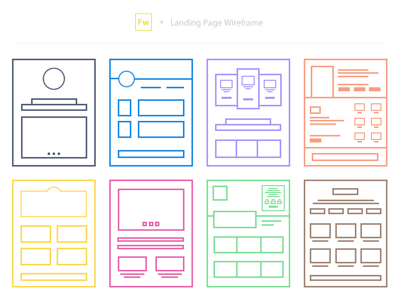
Image Source: Soumya Kanti Paul
Every landing page is focused on a particular target audience, which means that it’s vital to grab their attention, keep them engaged and eventually turn them into clients.
The sales funnel is becoming more difficult day-by-day as the competition is rising, so if a landing page is the introduction to your company, then you might need to use the following tips as a checklist on how UX can improve your conversion rates.
A landing page’s design should be clear and minimal, in order to avoid any confusion among visitors.
An appealing and simple design may lead to more impressive results than an overstuffed page, especially if it manages to serve its purpose.

This should be your first step when creating a new landing page. Before start its design and its formatting, think of your target audience.
All these questions (and even more) can help you understand your target audience and create the perfect landing page, depending on their needs and their expectations from your company.
Even if they haven’t heard about your service before, if you are able to analyse their online behaviour, then you’re already on the right track to create an effective landing page.
Don’t underestimate the importance of content when creating a landing page. Visual content may prevail in the online world, but written context will always be powerful. There’s no need to use jargon, or complex language that can alienate users.
Once again, think like a user, shape the message in your head, read it out loud and aim for clarity.
If you can’t explain your concept to your users in its simplest way, then you probably need to reconsider your message.
Whether it’s a signup field, or a newsletter subscription, a user-friendly form is crucial for the success of a landing page.
People are wary of sign up forms and giving out their personal details, so make sure that you’re only asking for what’s necessary. Find a reason to convince users to trust you, whether it’s a reward, or a highly appealing and relevant landing page, and return the trust with a quick and simple registration process.
Or else, you’re simply reducing the chances of increasing conversions with a simple mistake that could be avoided.

Your call-to-action should state your message in the most appealing way, both aesthetically and functionally. It’s not always easy to achieve this without the proper testing before, so be prepared to experiment with the effect of colours, shapes, sizes, and fonts for your CTA.
Will you create a button, or will you focus on a form?
The emotional design of a landing page may lead to the strategical placement of the key message in the right area of the landing page, the one that a user may see first.
This can enhance the chances of turning the visitor into a conversion, while simple psychological triggers can help the process.
A landing page’s content should reassure the users of their safety, their values, their needs, their importance, their personality, or even their time.
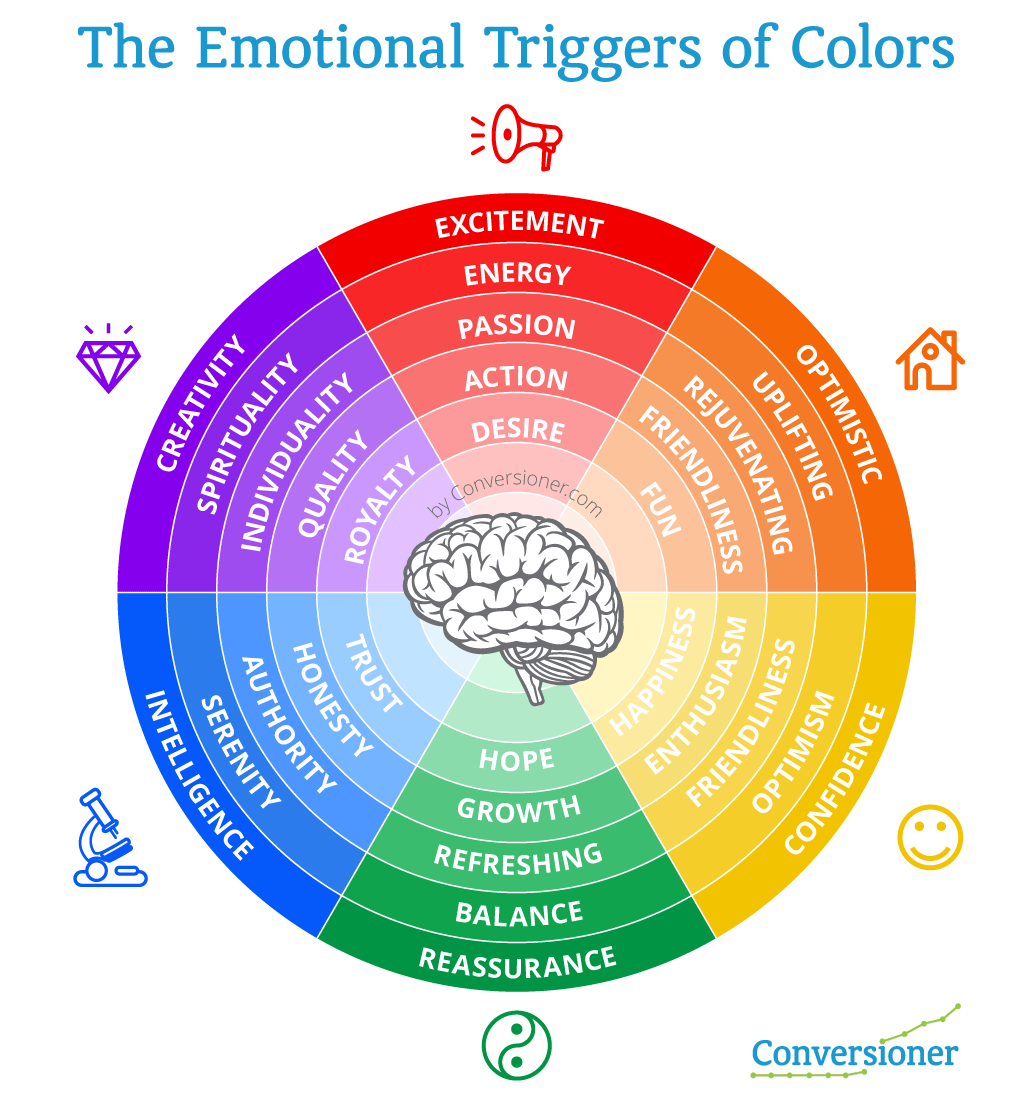
Even the use of colours may affect the user’s psychology and this is another reminder of why we cannot underestimate the needs of the user when creating a landing page.
Visual content can significantly enhance the appeal of a landing page, provided that it’s meaningful and it is supported by the right text.

There’s no need to fill a landing page with stock images just to make it more visual. Once again, simplicity is appreciated by customers and visual content may only increase the conversion rate when it manages to:
Mobile optimisation should be a priority for every landing page, and 48% of users who visit a non-mobile optimised page take it as lack of interest from the business.
As mobile users keep increasing, 83% of them now ask for a seamless experience across all devices. More and more users access a page through their mobile phones, which means they should indeed access the same browsing experience on any device.
What if a user accesses your landing page through a smartphone to learn more about your product and has trouble finding the CTA due to the poor mobile design?
Mobile design is all about focusing on the user and UX is more important than ever, in order to deliver the best results, leading to an appealing and effective page.
After all, Google is serious about its mobile updates and it’s planning to include page speed as a factor on its next update, which means that optimisation is becoming more important, aiming for simple, clear, light pages.
If you’re still unsure whether your landing page is passing the test of mobile optimisation, then Google can help you with this tool.
If you need to learn more about mobile optimisation and how it affects a site’s performance, feel free to read more.
People visit a landing page to learn more about a product, or a service. However, the visit won’t last long if you don’t convince them about your actual value.
Direct selling and its relevant language is not working online, so it’s time to educate your audience about your service and how it may benefit its target users.
Each landing page and its product should aim to solve a problem and what’s more important is that it needs to explain how it is actually solving it.
If the message isn’t clear both on the offered solution, but also on its method, then your conversion rate won’t reach the desired levels.
Whether it’s a short explanation with bullet points, a video, or a graphic, your landing page should try to appeal to its target audience by presenting its value and the reasons they should sign up.
There’s no need to include a navigation bar to your landing page, at least not if you’re trying to turn the visitor into a client.
A study back from 2013 measured that only 16% of landing pages were free of navigation bars (hopefully this has been improved lately), although it has been tested that the presence of a navigation bar affects the conversion rate.
There’s no need to make a user’s visit shorter or complex with the use of an additional menu, so maybe it’s time to remove navigation and test the results.
Distractions can be found everywhere and as our attention span gets shorter, it is becoming more difficult to focus on a single page for more than 5-10 seconds.
This makes it more difficult for a landing page to grab a user’s attention, and that’s why the page’s design should leave out as many distractions as possible.
Whether it’s a banner, a pop-up, a menu, or an external link, make sure your page’s design is not blocking you buying funnel and your goal to turn visitors into customers.
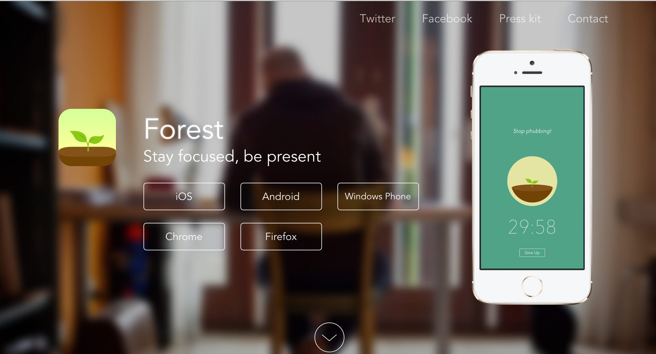
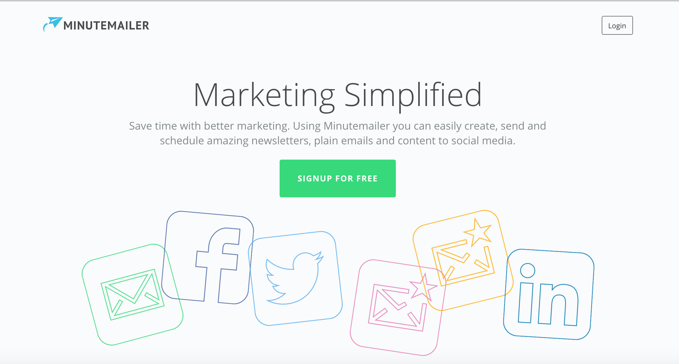
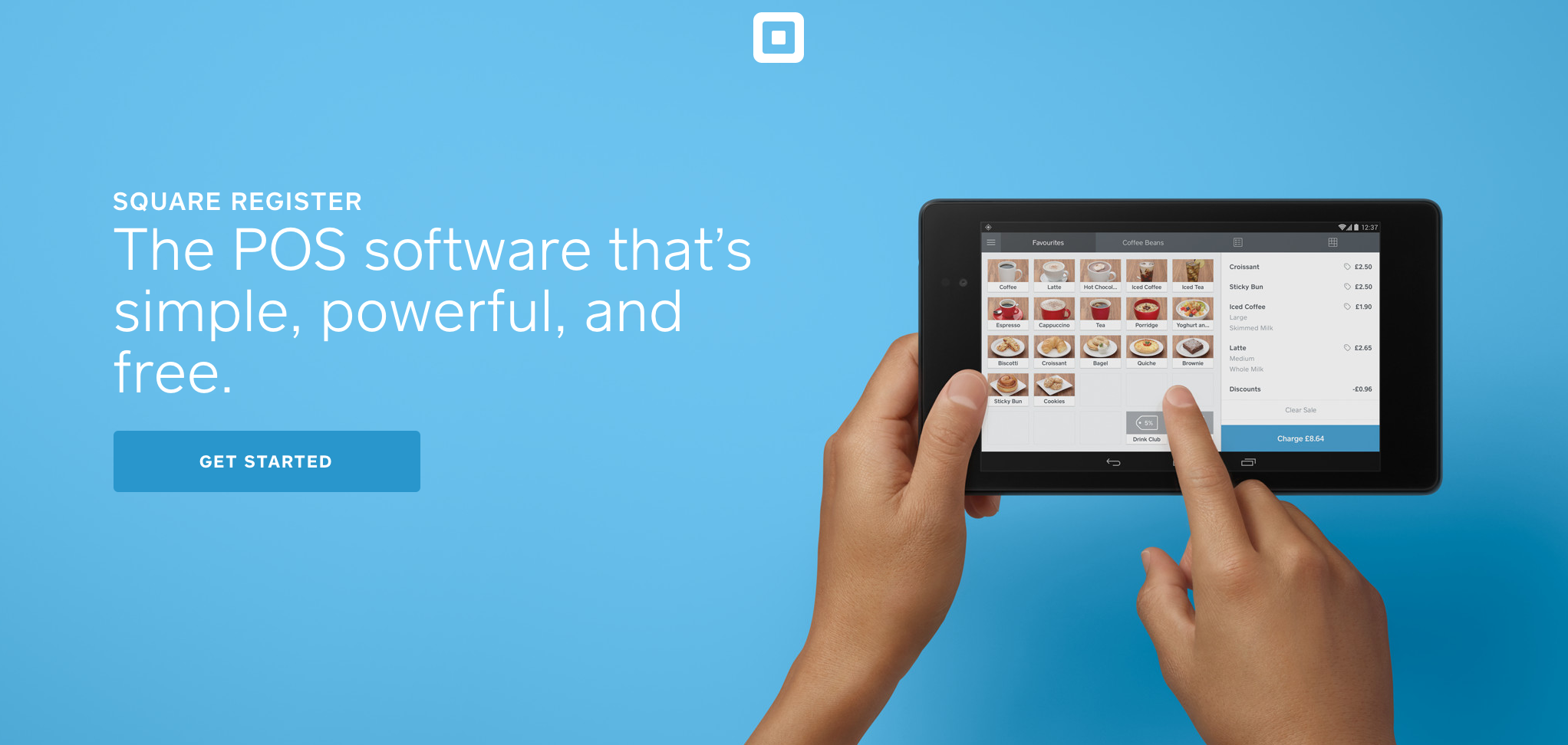
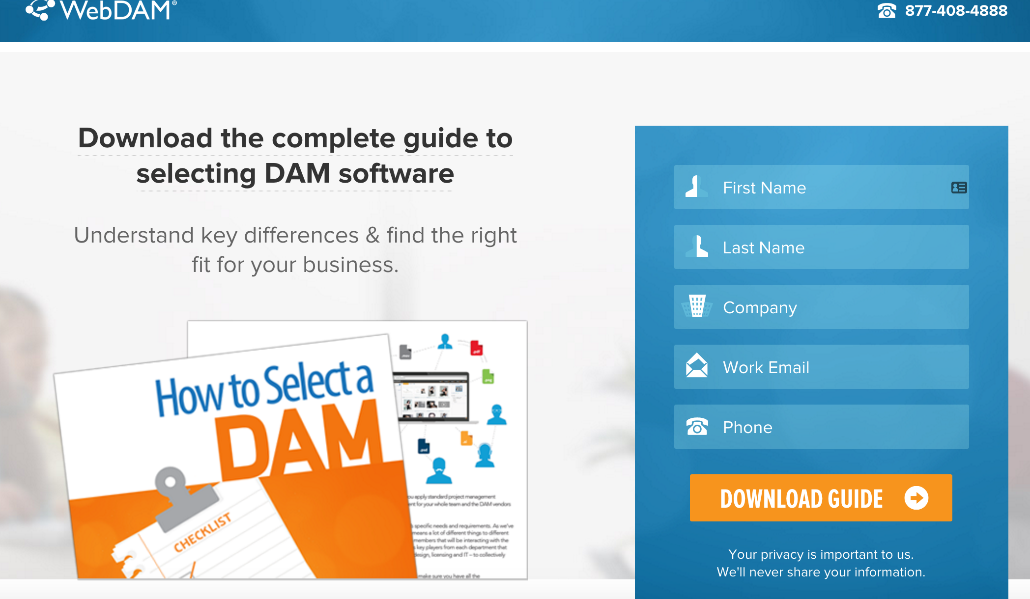
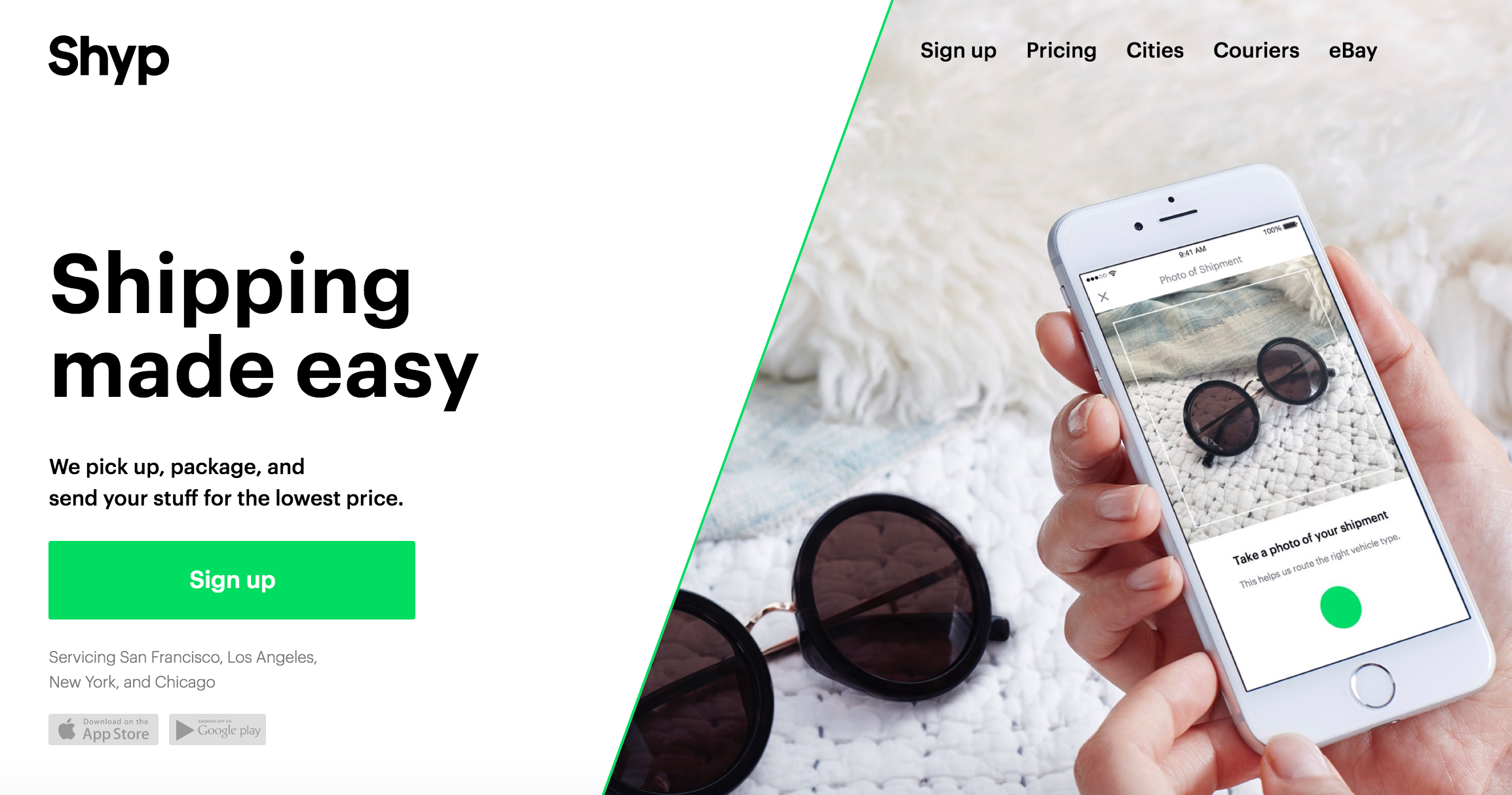
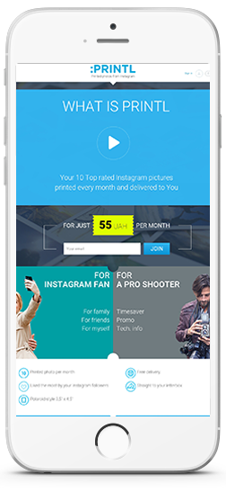
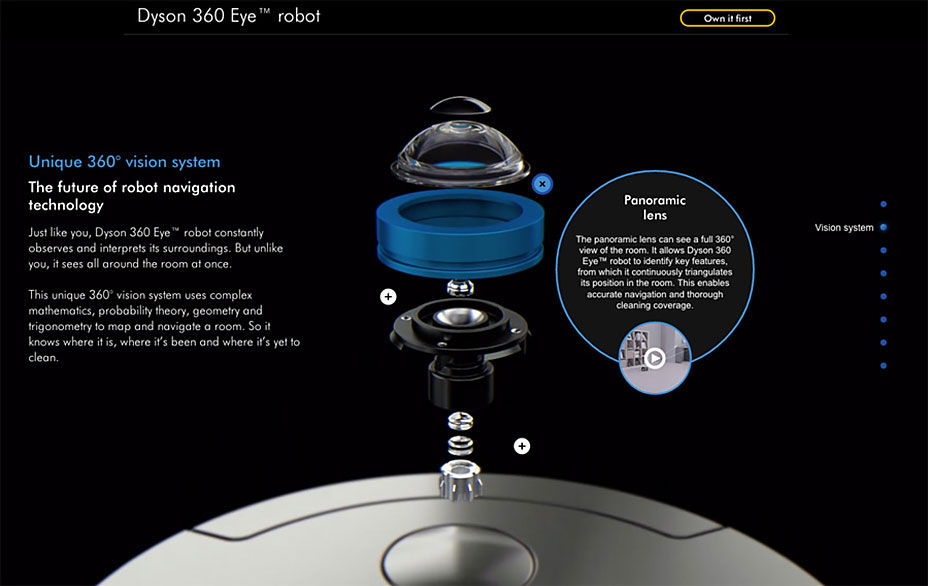
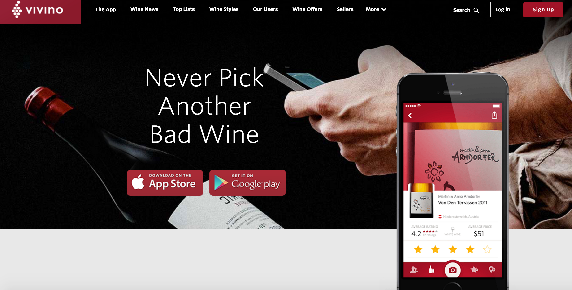
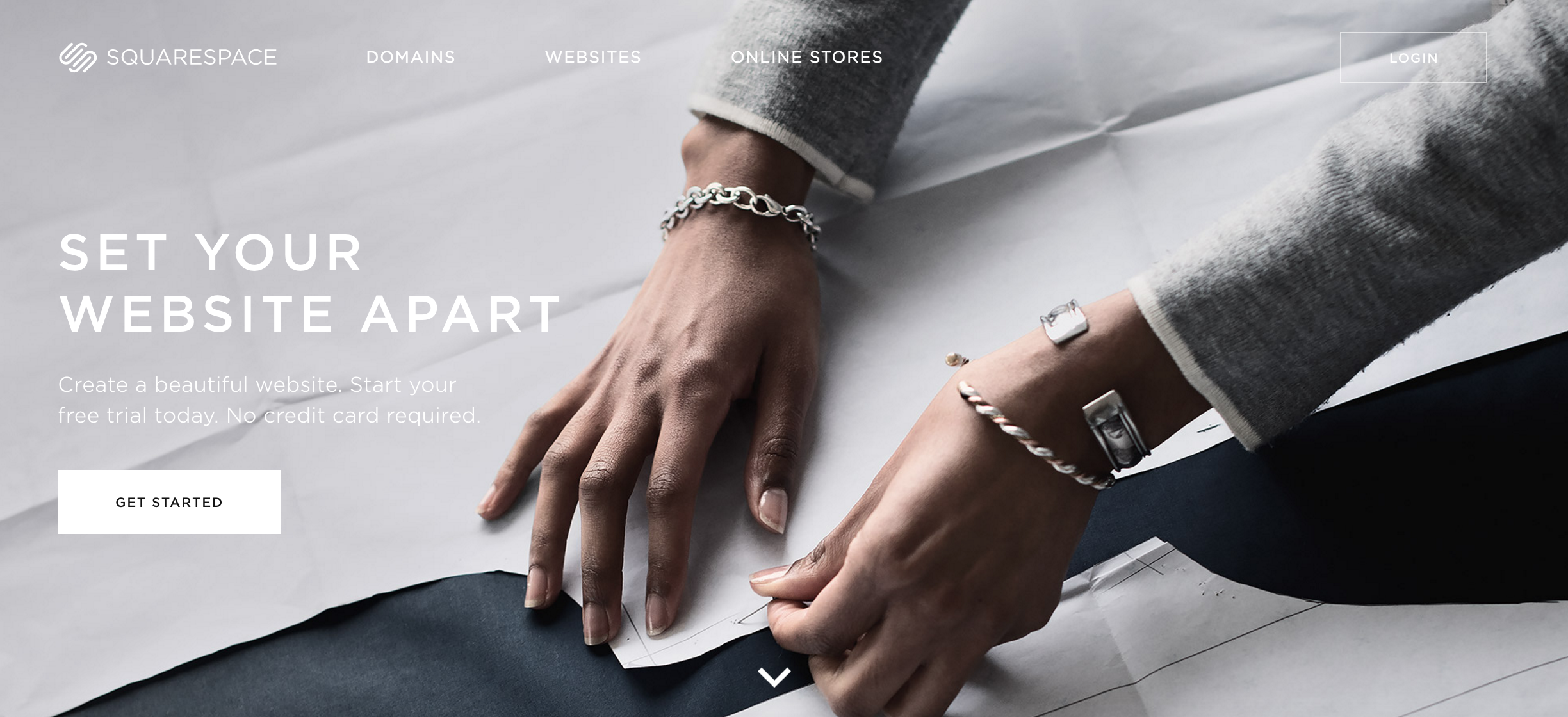
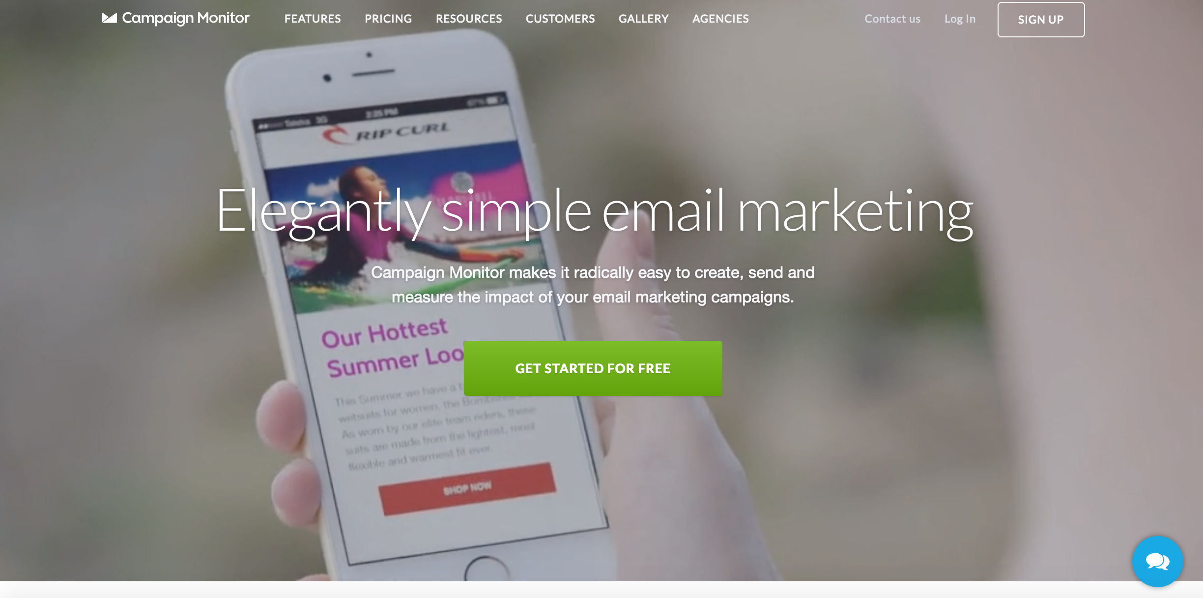
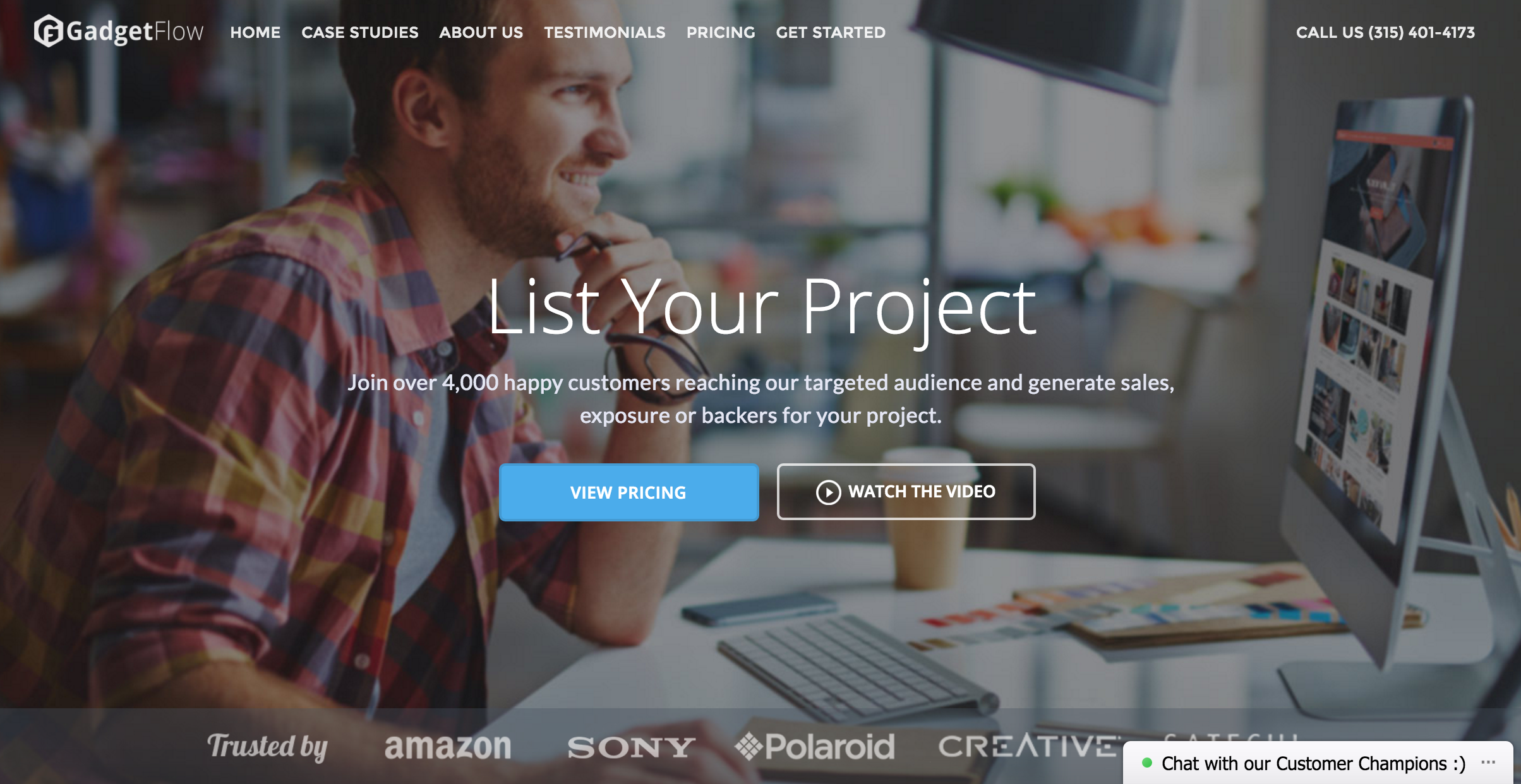
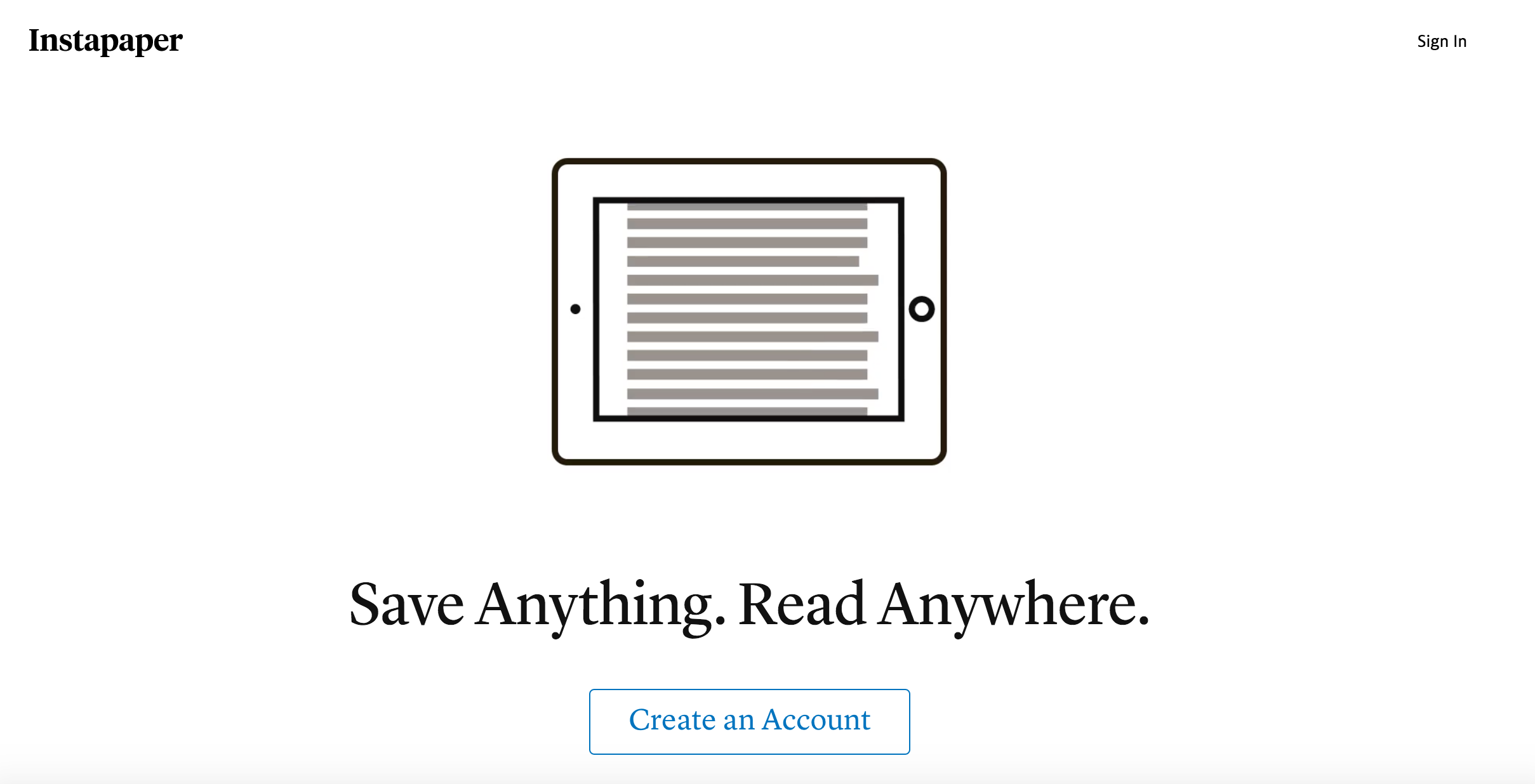
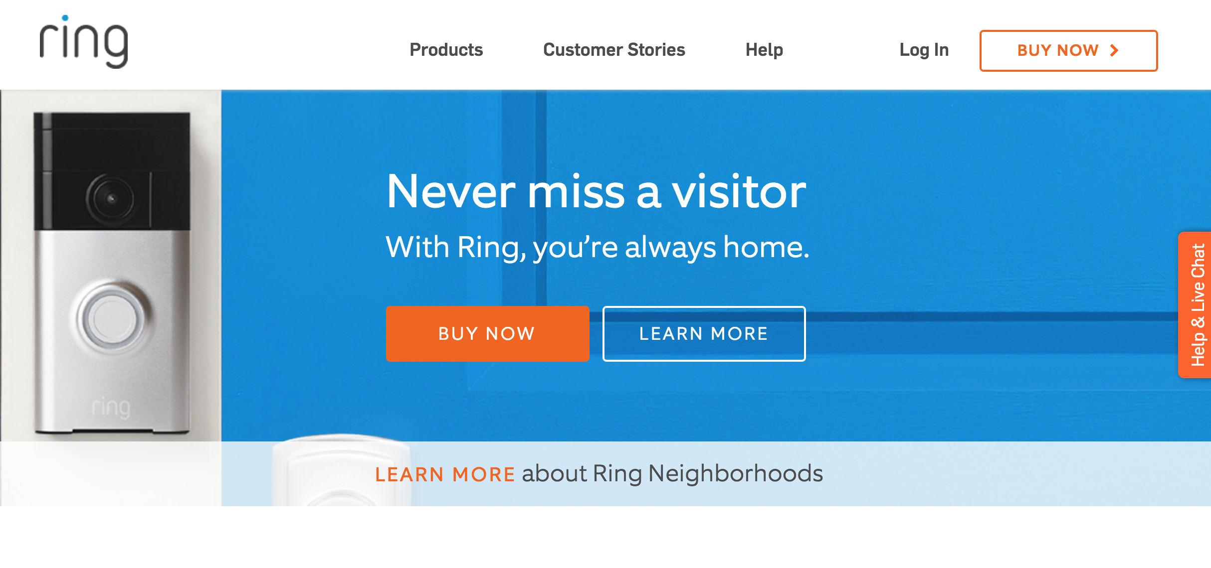
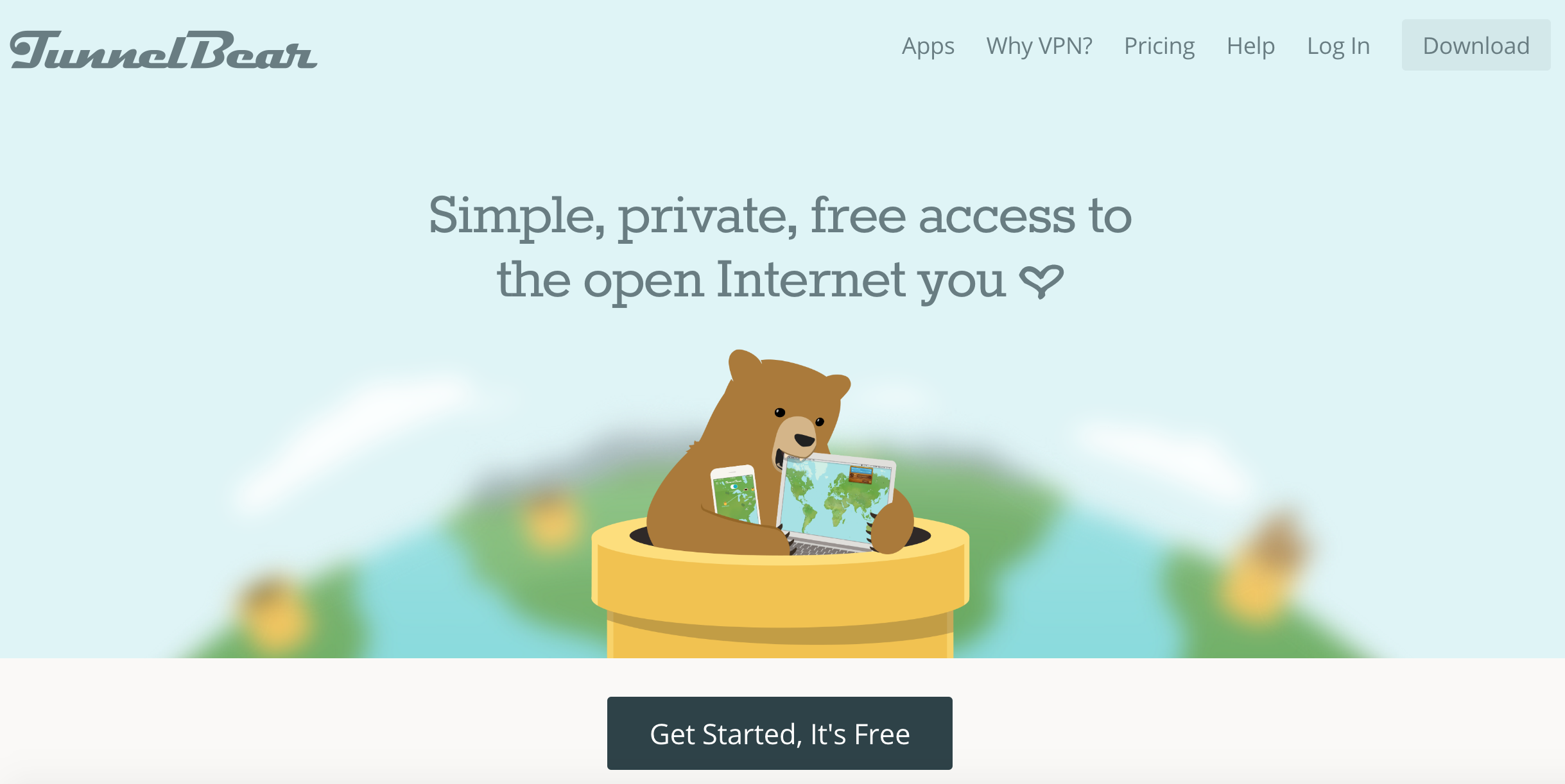
If you want to be inspired for your next landing page, here are some good examples we came across from many different fields.
These could serve as real-time examples for the tips above, while they are also offering the right creative direction for all the purposes a landing page may serve.

Leave a Reply
You must be logged in to post a comment.