Automating the process of narrowing down site traffic issues with Python gives you the opportunity to help your clients recover fast.
This is the second part of a three-part series. In part one, I introduced our approach to nail down the pages losing traffic. We call it the “winners vs losers” analysis. If you have a big site, reviewing individual pages losing traffic as we did on part one might not give you a good sense of what the problem is. So, in part two we will create manual page groups using regular expressions. If you stick around to read part three, I will show you how to group pages automatically using machine learning.
You can find the code used in part one, two and three in this Google Colab notebook. Let’s walk over part two and learn some Python.
Incorporating redirects
As the site our analyzing moved from one platform to another, the URLs changed, and a decent number of redirects were put in place. In order to track winners and losers more accurately, we want to follow the redirects from the first set of pages. We were not really comparing apples to apples in part one. If we want to get a fully accurate look at the winners and losers, we’ll have to try to discover where the source pages are redirecting to, then repeat the comparison.
1. Python requests
We’ll use the requests library which simplifies web scraping, to send an HTTP HEAD request to each URL in our Google Analytics data set, and if it returns a 3xx redirect, we’ll record the ultimate destination and re-run our winners and losers analysis with the correct, final URLs. HTTP HEAD requests speed up the process and save bandwidth as the web server only returns headers, not full HTML responses.
Below are two functions we’ll use to do this. The first function takes in a single URL and returns the status code and any resulting redirect location (or None if there isn’t a redirect.)
The second function takes in a list of URLs and runs the first function on each of them, saving all the results in a list.
This process might take a while (depending on the number of URLs). Please note that we introduce a delay between requests because we don’t want to overload the server with our requests and potentially cause it to crash. We also only check for valid redirect status codes 301, 302, 307. It is not wise to check the full range as for example 304 means the page didn’t change.
Once we have the redirects, however, we can repeat the winners and losers analysis exactly as before.
2. Using combine_first
In part one we learned about different join types. We first need to do a left merge/join to append the redirect information to our original Google Analytics data frame while keeping the data for rows with no URLs in common.
To make sure that we use either the original URL or the redirect URL if it exists, we use another data frame method called combine_first() to create a true_url column. For more information on exactly how this method works, see the combine_first documentation.
We also extract the path from the URLs and format the dates to Python DateTime objects.
3. Computing totals before and after the switch
4. Recalculating winners vs losers
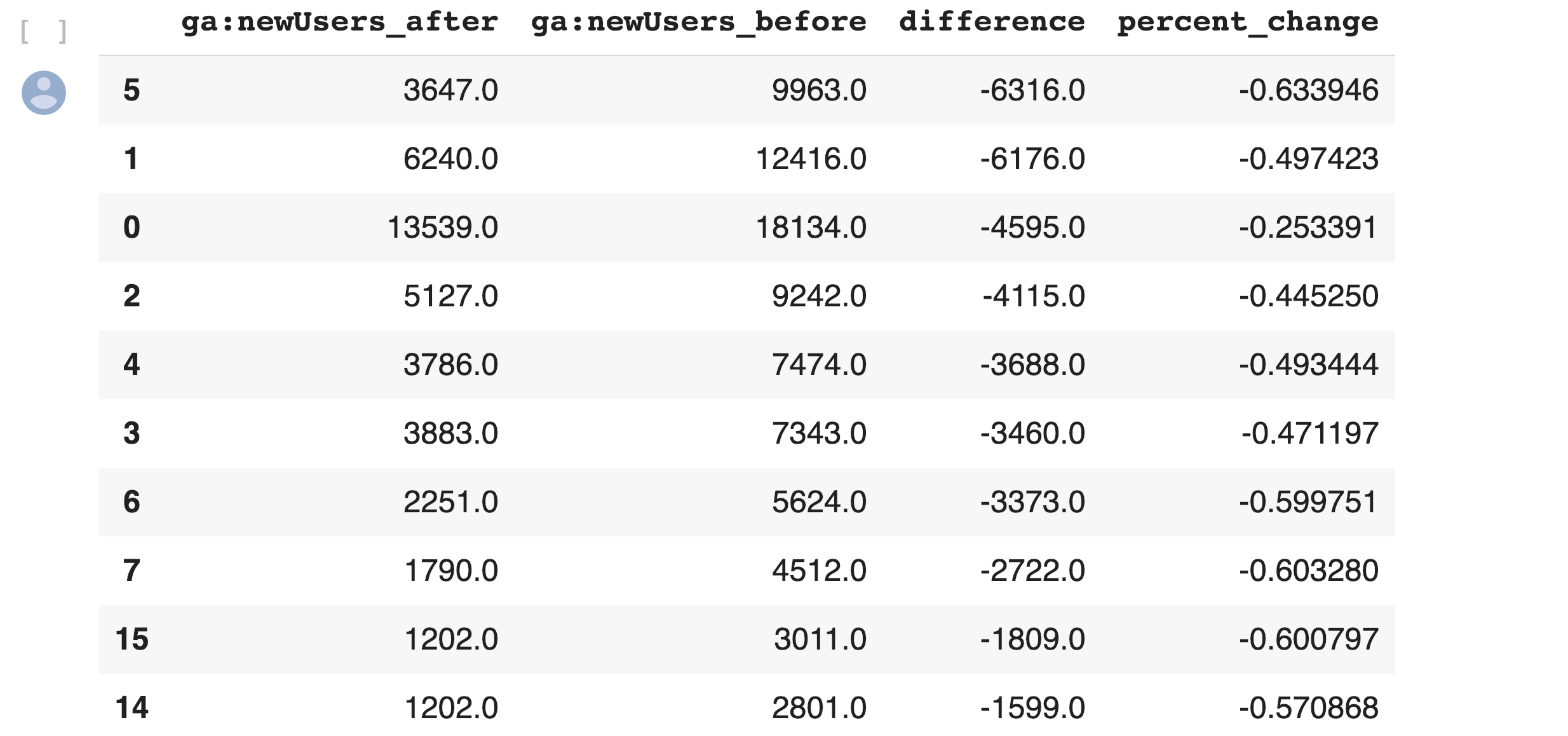
5. Sanity check
This is what the output looks like.

Using regular expressions to group pages
Many websites have well-structured URLs that make their page types easy to parse. For example, a page with any one of the following paths given below is pretty clearly a paginated category page.
/category/toys?page=1
/c/childrens-toys/3/
Meanwhile, a path structure like the paths given below might be a product page.
/category/toys/basketball-product-1.html
/category/toys/p/action-figure.html
We need a way to categorize these pages based on the structure of the text contained in the URL. Luckily this type of problem (that is, examining structured text) can be tackled very easily with a “Domain Specific Language” known as Regular Expressions or “regex.”
Regex expressions can be extremely complicated, or extremely simple. For example, the following regex query (written in python) would allow you to find the exact phrase “find me” in a string of text.
regex = r"find me"
Let’s try it out real quick.
text = "If you can find me in this string of text, you win! But if you can't find me, you lose"
regex = r"find me"

print("Match index", "\tMatch text")
for match in re.finditer(regex, text):
  print(match.start(), "\t\t", match.group())
The output should be:
Match index     Match text
11          find me
69          find me
Grouping by URL
Now we make use of a slightly more advanced regex expression that contains a negative lookahead.
Fully understanding the following regex expressions is left as an exercise for the reader, but suffice it to say we’re looking for “Collection” (aka “category”) pages and “Product” pages. We create a new column called “group” where we label any rows whose true_url match our regex string accordingly.
Finally, we simply re-run our winners and losers’ analysis but instead of grouping by individual URLs like we did before, we group by the page type we found using regex.
The output looks like this:


Plotting the results
Finally, we’ll plot the results of our regex-based analysis, to get a feel for which groups are doing better or worse. We’re going to use an open source plotting library called Plotly to do so.
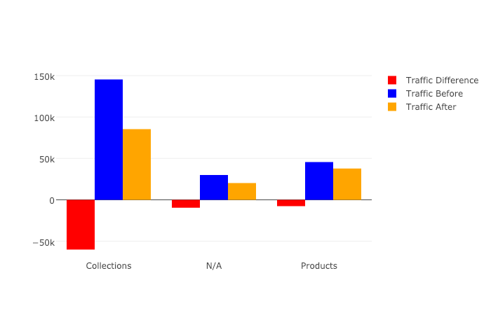
In our first set of charts, we’ll define 3 bar charts that will go on the same plot, corresponding to the traffic differences, data from before, and data from after our cutoff point respectively.
We then tell Plotly to save an HTML file containing our interactive plot, and then we’ll display the HTML within the notebook environment.
Notice that Plotly has grouped together our bar charts based on the “group” variable that we passed to all the bar charts on the x-axis, so now we can see that the “collections” group very clearly has had the biggest difference between our two time periods.
We get this nice plot which you can interact within the Jupyter notebook!

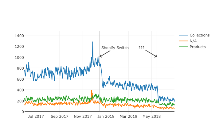
Next up we’ll plot a line graph showing the traffic over time for all of our groups. Similar to the one above, we’ll create three separate lines that will go on the same chart. This time, however, we do it dynamically with a “for loop”.
After we create the line graph, we can add some annotations using the Layout parameter when creating the Plotly figure.
This produces this painful to see, but valuable chart.
Results
From the bar chart and our line graph, we can see two separate events occurred with the “Collections” type pages which caused a loss in traffic. Unlike the uncategorized pages or the product pages, something has gone wrong with collections pages in particular.
From here we can take off our programmer hats, and put on our SEO hats and go digging for the cause of this traffic loss, now that we know that it’s the “Collections” pages which were affected the most.
During further work with this client, we narrowed down the issue to massive consolidation of category pages during the move. We helped them recreate them from the old site and linked them from a new HTML sitemap with all the pages, as they didn’t want these old pages in the main navigation.
Manually grouping pages is a valuable technique, but a lot of work if you need to work with many brands. In part three, the final part of the series, I will discuss a clever technique to group pages automatically using machine learning.
Hamlet Batista is the CEO and founder of RankSense, an agile SEO platform for online retailers and manufacturers. He can be found on Twitter @hamletbatista.