Top four contact page mistakes that cost you conversions
Your website's contact page is possibly one of the most viewed pages and an integral part of conversions. Here's how you can navigate contact page mistakes successfully.
Your website's contact page is possibly one of the most viewed pages and an integral part of conversions. Here's how you can navigate contact page mistakes successfully.
A contact page is a medium that connects you with your intended audience. More often than not, it will be one of the few pages that are mostly viewed on your website. It is also one of the most crucial parts to get your conversions. Sadly, chances are you are making a mistake or two that might be unknowingly costing you conversions. Some mistakes are more visible than others. Do you want to know whether or not you are already making any contact page mistakes?
Our article highlights the top four contact page mistakes that might be costing you conversions. It also teaches you how to fix them.
The exploration of a contact form is both trying and sacred, and it takes some time to get it right but takes only a moment to get it all wrong. Contact forms typically fall into two categories: Either too many fields or insufficient fields. So many areas that it involves inputting the maiden name of your maternal grandmother and, of course, the scary phone number request.
People want to tell you what they need to say to you. However, if you do not allow them, you can miss out on a conversion. On the other hand, not everyone has the patience and time to fill out twenty fields just to be able to ask you if their discount code will be active. In this case, you could also be losing on a conversion by failing to explain each form’s purpose or the right way to fill in their information.
Build your contact forms based on your site’s purpose and your site’s target audience. If a customer feels like your form does not sufficiently let them communicate their needs, it is a poor form.
If it takes more than two minutes to fill your form, it is a pointer that you are asking for too much from them. Instead of opting for the standard type of contact form that needs a name, address, and the message that they get, create your contact form based on your clients’ needs.
Doing this will help them to give tailored responses based on their individual needs. The questions on the forms are sufficient for them to gauge needs and wants without being overly invasive.
Forms are excellent. However, they are not the ultimately convenient way for a potential client to contact you for one reason or another. Usually, when a person is trying to contact you, it is more often than not, for something crucial, and you do not want to deprive them of it.
Creating more than one medium for them to contact you will make you seem fairly accessible. You don’t always need to follow the standard form. You can use other viable options such as call, chat, or email.
You do not need to add your phone number to your page. However, add other ways for users to contact you. If you are not comfortable adding an electronic or physical address, you can use your social media icons. Wonder site has an excellent example on this point.
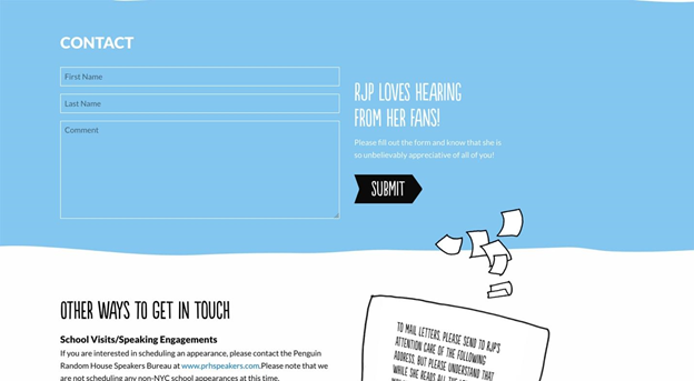
Source: Wonder
Replies from filled and submitted forms are not always guaranteed. People fill forms and do not get responses sometimes and this boils down to the fact that no one was monitoring what came in.
Failure to watch your form submissions is one way of tossing a potentially crucial opportunity away. It also speaks poorly about the management of your site, and the relationship you have with your users.
Connect your contact forms to an account that you are likely to check regularly. You can even assign this single task to someone. It does not make sense to have a contact form if you will not bother to respond to users who contact you. Here’s an example of another effective contact page by NJI3.
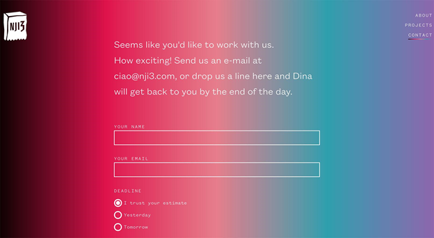
Source: NTI3
You want to make an effort to respond to all inquiries that come to your site. You can take this to another level by writing positive confirmations with a name attached to your contact forms. For instance, telling them that Joshua will get back to them before the end of 24 hours.
Doing this will compel your users to fill and submit the contact forms.
It is usual for things to break, however, leaving them broken is unusual. Like many things, forms can be broken in many ways.
Examples of broken forms are:
Forms can break for weird reasons. You are not always to blame for broken forms, primarily if you use a third-party application. However, your users will not see it in this light. They will take their conversions with them and flee your site.
Ensure to test your contact form at least once every month especially if you have not gotten submissions recently.
Doing this will enable you to detect any type of form error as they come before your users even notice. One sure way for your potential customers to tell if your form works correctly is when a confirmation alert pops up soon after clicking on the send button.
Contact pages are very crucial as it acts like a bridge that connects your business to the world outside. And because of the importance, you want to ensure that you are getting it all right. There are certain mistakes you might already be making that are costing you conversions. Our article provided the top four mistakes and their solutions that we hope will help you gain more conversions.
Grace P. is a Content Writer at Monify Media.