When the Internet was first used in households it was accessed through a cumbersome piece of technology, a desktop computer, and probably viewed on a CRT screen. These days we can access the Internet on a whole host of devices – from TVs to mobile phones to game consoles and e-readers. The poor desktop is getting dusty in the corner while everyone finds more portable and shinier ways to access online content.
This makes it important to ensure that your website will work on the range of devices available. There’s no better place to do this than with the Google Analytics‘ Mobile report.
The mobile report in Google Analytics can be found under Audience and contains two main reports; Overview and Devices, both of which I shall cover in detail here. Overview does what it says and gives a summary of data broken out for computers, mobiles and tablets. In the Devices report you will find a number of reports with a lot more detail about the mobile devices that were used by people viewing your website.
Overview
This report is broken down by Device Category of which there are three types: desktop, mobile and tablet. It’s great to have these broken down in this way, as “tablet” data never used to have its own category. However, as mentioned above, there really could be more than three types of device category so you will need to remember the following:
- Desktop also contains laptops, netbooks and games consoles such as Playstation 3 and the Nintendo Wii / Wii U.
- Mobile Phones covers smart phones and hand held games consoles such as the Nintendo 3DS and Playstation Vita.
- Tablets includes standard iPads, Google Nexus, Galaxy Tabs, and also e-readers such as the Kindle Fire.
The data to compare here is seen in the standard reports, starting with the Summary ABC report then breaking this down for Site Usage, Goals, and Ecommerce.
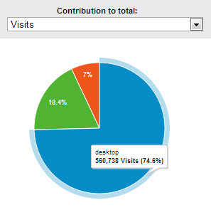
I find it beneficial to apply the pie chart option here to make it clear how important it is to use a responsive website. To do this, click the pie chart image in the top right hand corner of the data table.
The pie chart can also be used to show revenue for each category – this is particularly interesting compared to the “visits” pie where you can clearly see whether revenue accounts for the same percentage of revenue as it does visits.

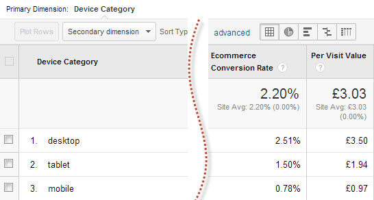
A top-level comparison of conversion rates is also important to consider. Have you checked that your conversions can be completed on as many different devices as possible?

With the move to Universal Analytics we’re all hoping that we’ll be able to tie user journeys together so that those visits on mobile phones with a low conversion rate can be viewed alongside the same user who may have used a desktop to convert but wouldn’t have completed the journey without the mobile visit.
Devices Reports
Initially we come to the Mobile Device Info Report. This effectively shows us the name of the device, including the branding and the model.
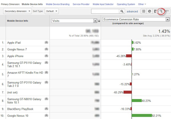
Reviewing the reports here we can identify the highs and lows across different devices. Using the “comparison with average” view you can see some interesting results:

Many devices give Google Analytics their full information under Mobile Device Info, for example Samsung GT-I9300 Galaxy S III.
Apple, however, doesn’t pass on the full device information to Google Analytics as simply, instead you will see all iPhones grouped under Apple iPhone, likewise iPads and iPods are not broken out by model. To break out Apple devices by generation you would need to use screen resolution alongside Mobile Device Info, either in a secondary dimension or advanced segment, as each generation (though not the models within them) uses a different resolution.
As the screenshot shows, this report combines mobiles and tablets, which isn’t always beneficial due to their differences. To get around this I would apply the built in advanced segment for mobiles and review that on its own before then applying the “tablets only” built in segment.
It’s also worth noting that this report doesn’t include desktop device information, meaning you can’t directly compare different types of computer and games console against each other to see where performance needs to be improved.
Mobile Device Branding
The branding report is often overwhelmed by volume for Apple devices. While Samsung have been increasing their share of the mobile and tablet markets recently they are still catching up with Apple, although this may vary in different countries.
This report is beneficial for identifying patterns with your website’s results – is there a problem with specific brands of device or do certain brands have a higher than average order value? Understanding what type of users you have is also beneficial. Furthermore, you can use this report to justify why you might benefit from creating a mobile app for a new platform.
Service Provider
This report is like the Service Provider report under Technology, but purely showing the data for mobile visits.
The benefits of reviewing this for mobiles alone is that it helps you to get an understanding of how your users are connected to the Internet.
Mobile Input Selector
Here you can see a breakdown of how users on mobiles are able to navigate the content on your website, whether through a touchscreen device, click wheel, stylus or joystick. You may also see (not set) reported here, this means the information was not available.
These days the majority of mobile users are accessing mobile content on a touchscreen, however it is good to see whether or not other methods need to be taken into account in your design stages.
Operating System
Again, this is the same report as Operating System found under Technology but segmented just for mobile devices. Most websites will see the major players (iOS, Android, Blackberry and Windows Phone), but other lesser known operating systems may also feature here.
As with previous points this report is good for checking that your website works across the range of operating systems used. Very high bounce rates (though not a hugely reliable metric) can be used to gauge whether or not there might be a problem on that technology. Conversion rate should also be consistent across operating systems with high numbers of visits.
Screen Resolution
This final report is accessed by clicking other and selecting Screen Resolution. This is an eye opening report as it shows such a wide range of resolutions. It can be beneficial to let your web designers know the range of resolutions that the website will be viewed in so they can ensure quality is maintained regardless of technology.
Additional Points
Each time you access these reports it’s beneficial to check how much the data is sampled by looking for a yellow box in the top right of the report. Sampling is where the report, being a segment of the total data, is based on a portion of the total data in order to process it faster.
By only using a portion of the total data the remainder is a guess so may not be as accurate as you require. You can make some adjustment to this using the grid style image under the date.
