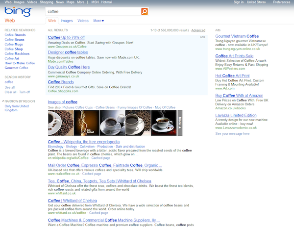
Calling it a “fresh, de-cluttered experience,” Bing launched a new design for its search result pages this morning. Based on feedback from user experience experiments that ran over the past few months, Bing changed their look to make the results easier to scan in an effort to help users do more with search.
Here’s the old look:

And here’s the new look:

The new design removes the left sidebar that previously contained related searches, options to refine your search and search history settings. Related searches now have two locations. They appear at the bottom of the results, just above the pagination and any bottom-of-page ads. There is also a separate list of related searches in the right-sidebar. That related list appears beneath ads, if there are any for your query.
Completing the minimalistic design are a top navigation for other Bing search properties like Images and Maps and an icon that resembles a gear is set top-left, along with login information. To add splash of style, albeit a small one, a 5-pixel high fragment of the Bing home page image appears, spanning the top margin.
Speaking of the home page, Bing says they’re not yet done making changes. They’re testing now for some new ideas for the homepage. Bing says the daily image is popular, so they are considering larger versions of the image.
Bing hopes the cosmetic changes will help people “spend less time searching and more time doing.” The changes to the search results page is part of removing distractions for the end-user. These changes also include an under-the hood update that provides “improved relevance” and increases the page-load times.
What do you think? Too white? More or less relevant. Does this change increase the likelihood that you’ll use Bing more? Let us know in the comments below?

