Yesterday Google announced a new SERPs layout on in a blog post tagged under the label ‘universal’.
On first grok it does not seem like much of a change. Just a new button that says “search tools” which is actually quite easy to miss. In fact it seems like such a small change that I struggled to remember what the ‘old’ SERPs looked like, only dimly recollecting that a left navigation sidebar might be missing. And if you are a tablet user you may have completely missed the difference as you will have already seen this SERPs design before – because it is exactly the same design for mobile and tablets, now on desktop.
Big deal huh? Well, yes, this could be part of Google’s recent move to combine desktop and mobile ads. But on features alone, aside from the new “search tools” feature, there is something quite exciting going on here. Yet there is a lot to be confused about too, so bear with me.
If you’ve looked at the response on Google+ you will have seen the usual complaints about the SERPs since Google launched the hated +You bar with the beige wallpaper. It’s mostly people re-iterating their dislike of the black bar and/or cries of users wanting their “vertical space” back.
Personally I don’t have any strong feelings about the design but it does seem “a bit odd” to now have certain categories of searches essentially repeated in two layers of navigation. I can click web, images or maps in the black bar, but now have the identical option in the new bar between the search box and the search results. It does seem like a needless waste of space that could invite more criticism about pushing results down.
+You Bar Vs Content Type Bar
For the record, I would like to say that in our own tests on SEW of having two using navigation bars (that had different content), we found that they either confuse users or people just don’t use one of them. I will dig up our eyetracking results on that for a later story.
However, in this new Universal SERPs layout from Google, the second navigation bar – unlike the +You bar – is actually dynamic. It is curating source or content types based on the query. This was probably happening before when these options were in the sidebar, but it wasn’t as noticeable.
Now, with it in the eyeline of the results and with a red marker to denote the content type you are filtering by, it really is difficult to miss. A search for “Bubbles!” to find a clip from Finding Nemo brought the app results to my attention with a surprising number of results. However, it was searches for ‘classic amiga games’ that made generic search for apps more useful. Generic terms generate mixed results in the on-device appstores in my opinion.
Whilst not the full list of games I already know are available by name, the results below brought results for games I would not have known to search for by name. And that kind of thing points at an opportunity for search engine optimization.

If you are doing appstore optimization these results could prove to be more interesting. Especially for competitor research. I was surprised how many app results there were for generic searches. Also the search tools feature allows you to filter the results depending on mobile app platform.
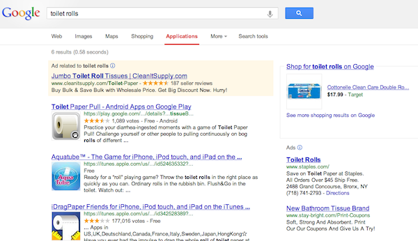
For instance, sort of amazingly, there are app results for ‘toilet rolls’ and ‘toilet paper’ but the most famous app from toilet roll manufacturer Charmin isn’t listed.

Whilst, I can’t imagine there is a reason for Charmin to worry about lost marketshare, it does highlight areas in which mindshare and marketshare still don’t necessarily tally between mobile apps and mobile web.
For example, in the result below, Charmin distirbution partners own the paid shopping results, but their popular branded app is nowhere to be found in the app results.

And before you ask why I was searching for toilet paper… what are your thoughts on the latest Google SERPs layout – Good news for app marketing? Or two bar design fail whale?


Leave a Reply
You must be logged in to post a comment.