AnalyticsA Guide To DoubleClick Executive Reporting

A Guide To DoubleClick Executive Reporting

The simplicity, chart customization, and use of formula columns makes Google's DoubleClick Executive Reports a valuable tool for account management for all levels of a business.

Google’s DoubleClick Search is a search management platform that offers a wide range of tools for managing multiple accounts across multiple engines. One feature available is Executive Reporting, which allows quick creation of custom reports across synced DS accounts. The simple creation and highly-visual format is not only a great optimization tool, but it’s also fantastic for sharing performance across all levels of a business.

A variety of charts can be pulled together into a dashboard format. All charts can be simply segmented, filtered and annotated to ensure the most important data is pulled through. As well as automatically updating for specified date ranges, these reports can be exported as PDF or into Excel, and also accessed via a link. Read on for a summary of how to create and a few tips for utilizing further.
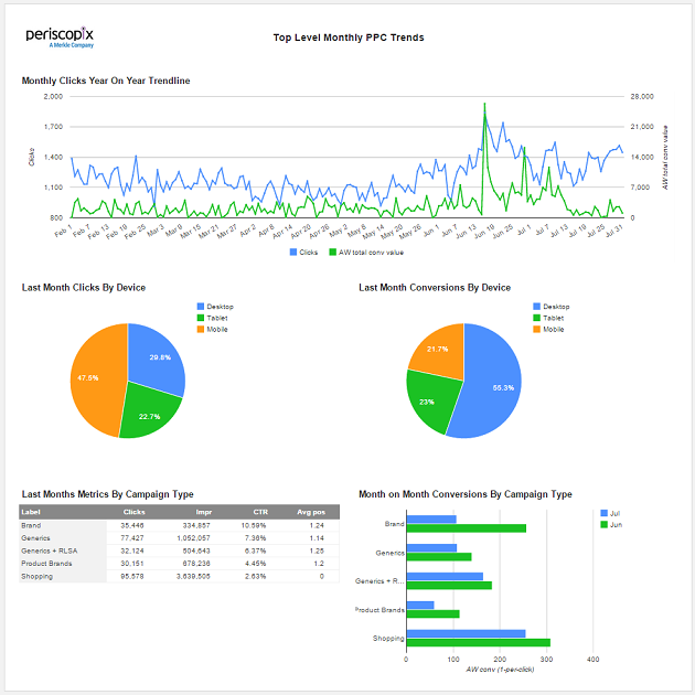
executive-reports-doubleclick

Where to Start

In the top banner, navigate to the executive reports tab and create a new report. Here, select the accounts you want selected within your report.

exec-reports-creation

Add a page header, which is customizable; add company logos, edit the background color and font to line up with company branding. This creates a really nice format to share with clients and across businesses.

exec-reports-page-header

Add multiple pages; this is useful when various people at different business levels need access to the stats. Create pages with top-level trends aggregated from all accounts, and add pages that take a deep dive into more specific areas of the account. Reports and Pages can also be copied, which is a fantastic feature if you are reporting on different territories. Once copied, you can easily filter down to the campaigns within the target location.

If you’re used to pulling data and pivoting in Excel on a regular basis, adding charts will save you a lot of time. You have a choice of five chart formats: Bar Chart, Mixed Bar and Line Chart, Line Chart, Pie Chart, and Tables.

Chart Creation

Charts can easily be filtered and segmented to a variety of useful formats.

exec-reports-chart-creator

  • Time ranges are flexible; the reports will auto-update based on the metrics you select. If you choose Last Month, the report will repopulate on the first of the following month, which allows simple, consistent reporting.
  • Compare to the previous year, period or a custom date range. This is useful for pulling year-on-year trend analysis, as well as comparing how bursts of marketing activity, such as sales, have compared.
  • Filtering options are flexible and allow you to easily drill down to the data you need. Filter to different levels of accounts: engines, accounts, campaigns, and labels. Use match options including, “equals,” “does not equal,” “contains,” “does not contain,” and “starts with.” Layer your filters, and make use of “and” and “or” targeting. Look at all devices or narrow your results down to focus on only desktop, tablet or mobile.
  • Metrics can pull in all metrics available in DoubleClick, including AdWords, Google Analytics, Formula columns and Floodlights. The use of formula columns in particular here is a great addition, as this allows reporting to be easily lined up with business reporting. For example, adding profit margins.
  • Segmentation lets charts be split by periods of time, accounts, campaigns, labels and device.
  • Titles and annotations can be added to all charts at this point.

Where Next

These reports are super quick to generate and edit. Below are my five main reasons for using:

  1. It’s easy to create consistent weekly and monthly reports that can be annotated to explain changes in performance. Further charts can be easily added in.
  2. The quick creation also means the reports can quickly be pulled and shared on an ad hoc, if a less standard report is needed. The tool takes away the need to download large sets of data and pivot into useful charts.
  3. You’re able to utilize labels to help group sections of an account together. This will help aggregate the data into a more digestible format when running accounts with large amounts of campaigns and ad groups.
  4. Formula columns will help align the reports across a business, such as adding in agency and platform costs.
  5. The reports align with business branding. While the page header can be formatted to align with brand, the chart formatting, coloring and font cannot currently be edited. The work around is to download into Excel; the charts can be easily formatted at this point. This is incredibly useful when you need to create charts for a presentation that needs to align with a business’s branding.

It would be nice to see DoubleClick introducing the ability to analyze keywords and ad copy within these reports over the next few quarters. However, for campaign-level reporting these reports offer a great opportunity to save all account managers some time in Excel that can be used on optimization instead.

Resources

The 2023 B2B Superpowers Index
whitepaper | Analytics

The 2023 B2B Superpowers Index

9m
Data Analytics in Marketing
whitepaper | Analytics

Data Analytics in Marketing

11m
The Third-Party Data Deprecation Playbook
whitepaper | Digital Marketing

The Third-Party Data Deprecation Playbook

1y
Utilizing Email To Stop Fraud-eCommerce Client Fraud Case Study
whitepaper | Digital Marketing

Utilizing Email To Stop Fraud-eCommerce Client Fraud Case Study

2y