One year after Google put an algorithmic premium on mobile experience, the so-called “Mobilegeddon,” Google is at it again. New tools are coming in late spring to help webmasters make their websites work better on mobile devices.
Mobilegeddon was the consequence of businesses not making their websites easier to use on smartphones and other mobile devices. Google’s updates were an incentive to reward webmasters by ranking mobile-friendly websites higher in search results.

However, there was fallout: webmasters without mobile optimized sites saw as much as a 12% plunge in traffic to non-mobile sites, according to an Adobe study in July 2015.
Small businesses in particular suffered because only a third of such businesses had a mobile optimized website, according to eMarketer.
Google must focus on mobile because more than half of all Google searches are from smartphones and mobile devices. If consumers do not have a good experience when they click on a mobile SERP link, they will likely leave the page (and Google).
Specifically, a Google survey from late 2015 reported a loss of 29% of smartphone users if a site doesn’t satisfy their needs (lack of information or slower load times).
Furthermore, studies show that even a one second increase in load time can lead to an 11% decrease in page views, a 7% decrease in conversions and a 16% decrease in satisfaction.
Mobile-optimized sites are now central to a satisfying web experience.
So as the trend towards mobile continues, there are two reasons why businesses want to optimize their websites for mobile devices: superior customer experience and search engine ranking – and in fact, both are interconnected.
When Google rolled out Panda in 2011, they forever shifted algorithmic signal to include both relevance and quality. Therefore, without a superior customer experience (read: good UI), Google will not give a website a shot at a top SERP ranking and, in turn, high search results won’t result in increased user engagement.
But, mobile Information Architecture (IA) and User Interface (UI) is hard. Because of their mobility, small screen size and cumbersome keyboard entry, consumers interact with mobile devices in an entirely different way than with laptops or desktops and in a different context.
Mobile users do not have patience for anything that’s short of being intuitive, relevant and fast.
Making your web page play nice across multiple devices, which has come to be labeled “responsive web design” means that you can use one URL that will adjust to whatever device it’s being used on.
Many websites still require horizontal scrolling or zoom on mobile, and layouts should be viewable on mobile without these shortcomings to the user experience. Responsive pages that can be viewed with ease on a desktop PC, tablet or smartphone are critical to making your webpage stickier for mobile users as well as saving on the cost of developing separate sites for multiple devices.

Google is not, however, throwing businesses under the bus. The new tools will allow businesses to enter their website URL to get a diagnostic check to explain why their website isn’t mobile-friendly as well as how to improve the site. The time is (past) if you weren’t pro-active ensuring your site is mobile-friendly – stop everything and call a mobile savvy partner to make it so.
The good news is that brands that invest in mobile optimization and mobile strategies will crush the competition. If there is one unifying theme across all demographics, millennials in particular, it is the pervasive use of mobile devices to research and shop.
In fact, 93% of people who use a mobile device for research make a purchase and according to internal ConsumerAffairs user data, mobile visitors purchase within 2-4 hours compared to 1-3 days for desktop visitors.
Any user interface should be developed considering the way users engage with their mobile devices. Hold it in your hand, and walk through some of the sites you frequent on mobile. Ask yourself these questions:
- How long does it take the site to load?
- How do your hands engage with the site?
- Are you needing to scroll far to get info?
- Do you have trouble navigating to the point of a form fill or purchase?
- Is it easy to click and call the business?
- Where are menu items placed on the mobile UI, and where does your hand align with those menu items and calls to action?
Evaluate your customer journey pathways and imagine what your UI could do to give a smoother experience to mobile users.
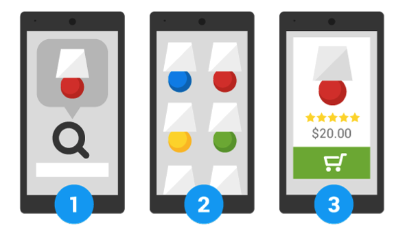
To make sure you are converting web visits to sales, a mobile-friendly website must have print that is big enough to read without having to constantly pinch and zoom; tasks need to be simplified; links need to be clearly visible and spaced far enough apart so that errant clicks don’t occur.
For example, we love the way Flipboard’s user interface aligns with their business objectives. Flipboard gives people a single place to follow all of their interests and then save or share stories, images, and videos into their own Flipboard magazines. To that end, their mobile site is fast, simple and intuitive. The reward? 82 million monthly readers.

To compete for mobile customers and higher search engine rankings, marketers must become mobile UI architects to design a more intuitive and relevant customer experience. Mobile is no longer the alternate platform, it is now the platform of choice.
Mobile devices are the new norm. We do everything on them from making dinner reservations, finding a date, managing our bank accounts, to hailing a ride. Mobile has changed the very foundation of how consumers communicate, connect, and discover online.
Not surprisingly, consumers expect brands to provide a superior mobile experience.
Leave a Reply
You must be logged in to post a comment.