Three fundamental factors in the production of link-building content
I've analyzed over 120 pieces of content across 16 industries to define common threads between campaigns that exceed or fall short of their expectations.
I've analyzed over 120 pieces of content across 16 industries to define common threads between campaigns that exceed or fall short of their expectations.
One of the most overused phrases in content marketing is how it is an ever-changing landscape, forcing agencies and marketers to adapt and improve their existing processes.
In a short space of time, a topic can go from being newsworthy to negligible, all while certain types of content become tedious to the press and its readers.
A vast amount of the work we do — at Kaizen and many other similar agencies — is create content with the sole purpose of building high authority links, making it all the more imperative that we are conscious of the changes and trends outlined above.
If we were to split the creative process into three sections — content, design, and outreach strategy — how are we able to engineer our own successes and failures to provide us with a framework for future campaigns?
Over the past month, I’ve analyzed over 120 pieces of content across 16 industries to locate and define the common threads between campaigns that exceed or fall short of their expectations. From the amount of data used and visualized to the importance of effective headline storytelling, the insight is a way of both rationalizing and reshaping our approach to content production.
Behind every great piece of content is (usually) a unique or noteworthy set of data. Both static and interactive content enables us to display limitless amounts of research which provide the origins of the stories we try to communicate. However many figures or metrics you choose to visualize, there is always a point where a journalist or reader switches off.
This glass ceiling is difficult to pinpoint and depends on the type of content, and the industry or readership you’re looking to appeal to, but a more granular study of good and poor performing campaigns that I performed suggested some benefits of refining data sets.
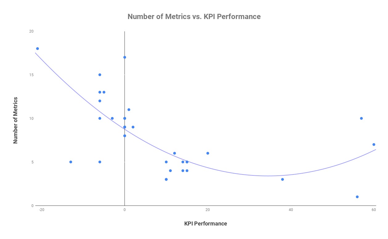
A starting point for any piece of research is the individual metrics, whether it is cost, type, or essentially anything worth measuring and comparing. In my research, in the content campaigns that exceed our typical KPI, there was an average of just over 5 metrics used on each piece compared to almost double in campaigns with either a normal or below satisfactory performance. The graph below shows the correlation between a lower number of metrics and a higher link performance.
An example of these findings in practice can be found in an infographic study completed for online travel retailer Lastminute.com that sought to find the world’s most chilled out countries. Following a comprehensive study of 36 countries across 10 metrics, the task was to refine these figures in a way that can be translated well through its design. The number of countries was whittled down to just the top 15, and the metrics were condensed to have four indexes which the rankings were based on. The decision to not showcase the data in its entirety proved fruitful, securing over 50 links, covered by the Mail Online and Lonely Planet.
As an individual who very much enjoys partaking in the research process, it can be extremely difficult to sacrifice any element of your work, but it is that level of tact in the production of content that distinguishes one piece from another.
Regardless of how saturated the content marketing industry becomes, we are graced every year with new and innovative ways of visualizing data. The balancing act between originality in your design and an unnecessarily complex data-visualization is often the point on which success and failure can pivot. As is the case with data, overloading a piece of content with an amass of multi-faceted graphs and charts is a surefire way of alienating your users, leaving them either bored or confused.
For my study, I decided to look at the content that contained data visualizations that failed to hit the mark and see whether the quality is as much of a problem as quantity in terms of design. As I carried out the analysis, I denoted the two examples where one visual would incorporate most or all of the study, or the same illustration was replicated several times for a country, region or sector. For instance, this study, from medical travel insurance provider Get Going, on reliable airlines condenses all the key information into one single data-visualization. Conversely, this piece from The Guardian on the gender pay gap shows how it can be effective to use one visual several times to present your data.
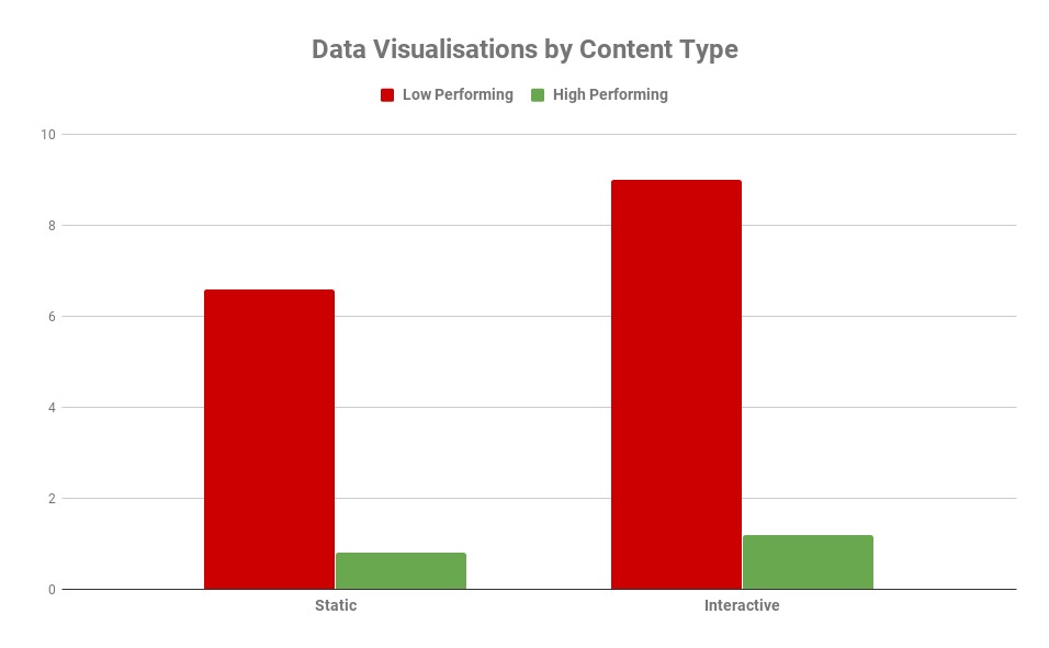
Unsurprisingly, many of the low scorers in my research averaged around eight different forms of data visualizations while high achievers contained just one. The graph below showcases how many data-visualizations are used on average by high and low performing pieces, both static and interactive. Low performing static examples contained an average of just over six, with less than one for their higher-scoring counterparts. For interactive content, the optimum is just over one with poor performing content containing almost nine per piece.
In examples where the same type of graph or chart was used repeatedly, poor performers had approximately 33 per piece, with their more favorable counterparts using just three.
It is important to note that ranking-based pieces often require the repetition of a visual in order to tell a story, but once again this is part of the balancing act for creatives in terms of what type and how many data-visualizations one utilizes.
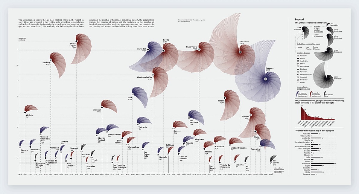
A fine example of an effective illustration of the data study contained in one visual comes from a 2017 piece by Federica Fragapane for Italian publication La Lettura, showcasing the most violent cities in the world. The chart depicts each city as a shape sized by its homicide rate, with other small indicators defined in the legend to the right of the graphic. The aesthetic qualities of the graph give a campaign, fairly morbid in the topic, an extended appeal beyond the subject of just global crime. While the term “design-led” is so-often thrown around, this example proves how effective it can be to integrate visuals effectively through your data. The piece, produced originally for print, proved hugely successful in the design space, with 18 referring domains from sites such as Visme.co.
Kaizen produces hundreds of campaigns on a yearly basis across a range of industries, meaning the task of looking inward is as necessary today as it ever has been. Competition means that press contacts are looking for something extra special to warrant your content’s publication. While ingenuity is required in every area of content marketing, it’s equally important to recognize the importance of getting the basics right.
The task of outreach can be won and lost in several ways, but your subject line is, and will always be, the most significant component of your pitch. Whether you encapsulate your content in a single sentence or highlight your most attention-worthy finding, an email headline is a laborious but crucial task. My task through my research was to find how vital it is in terms of the end result of achieving coverage.
As part of my analysis, I recorded the backlinks of a sample of our high and average content and recorded the headlines used in the coverage for each campaign. I found in better-performing examples, over a third of links used the same headlines used in our pitch emails, emphasizing the importance of effective storytelling in every area of your PR process. Below is an illustration in the SERPs of how far an effective headline can take you, with example coverage from one of our most successful pieces for TotallyMoney on work/life balance in Europe.

Another area I was keen to investigate, given the time and effort that goes into it, is how press releases are used across the coverage we get. Using scraping software, I was able to pull out the copy from each article where a follow link was achieved and compare it to the press releases we have produced. It was pleasing to see that one in five links contained at least a paragraph of copy used in our press materials. In contrast, just seven percent of the coverage within the lower performing campaigns contained a reference to our press releases, and an even lower four percent using headlines from our email subject lines.
These correlations, similar to the ones discussed previously, suggest not only how vital the execution of basic processes are, but serve as a reminder that a campaign can do well or fall down at so many different points of production. For marketers, analysis of this nature indicates that a refinement of creative operations is a more secure route for your content and its coverage. Don’t think of it as “less is more” but a case of picking the right tools for the job at hand.
Nathan Abbott is Content Manager at Kaizen.
Leave a Reply
You must be logged in to post a comment.